
Motomichi Nakamura’s Frolicsome Monsters
By Halleta Alemu

New York City 3000, Motomichi Nakamura, courtesy of the artist
Known for his kaleidoscope of terrifying, yet frolicsome monsters, Motomishi Nakamura uses his art practice to unravel the emotion of fear. His monsters which take the shape of silly, cryptozoological beings are consistently depicted in red, black, or white and toggle the line between being frightening and humorous.
His oeuvre flows through a variety of mediums ranging from animation, projection mapping, murals, and sculptural installations, to just name a few. Taking a look at his Instagram, you can witness Nakamura’s playfulness in his approach. Often projecting his signature set of blinking red eyes throughout New York City on a variety of subjects. Completely rogue, he sets up these projections on the fly. Whether it be on a bridge, a side of a building, or even a trash can. His work both humanizes and lifts the ordinary into the supernatural. Creating an interactive experience for anyone who comes across it.
His most notable commissioned endeavors include New York City 3000 — a piece he created in tandem with The Metropolitan Transportation Authority (MTA) in New York City, shown on a 52-screen digital display at the bustling Fulton Street Station. The animation features a retro sci-fi cityscape featuring Nakamura’s family of monsters. As busy travelers commute, they’re met with a futuristic version of the city that mirrors the diversity, compelling architecture, and energetic vibrance New York City pumps and radiates.
With a cross-cultural background of growing up in Japan, to now living in New York City, his work encompasses a fusion of cultural energies. Taking influence from Shinto, the indigenous Japanese religion that believes everything around us is living, Nakamura’s practice is motivated by a sincere exploration of how we can understand each other better. As well as, how we can make the subject of fear less frightening. He believes that if people take a playful approach to understanding fear, they can shift their relationship with it. How essentially inside of fear, is a feeling of excitement — triggered by just a flick of a perspective change.
Below, Nakamura takes us deeper into the details of his process, how he sculpted the three-color palette of his visual world, and what he ultimately believes is the role of the artist.
The following interview has been edited for length and clarity.

Image of the artist, courtesy of Motomichi Nakamura

From Beneath the Earth, Motomichi Nakamura, image courtesy of Third Dune Productions
Your work consists of a collection of frightening, yet playful monsters – what do these monsters symbolize for you?
The way I view monsters, mythical creatures, or even cryptozoological monsters are sort of like visualized versions of fear. We all deal with fear on a daily basis, one way or another. I just found that when I started making art, I found it very interesting in the old times people used to basically visualize everything. For example, thunder in North America — they came up with this monster called the Thunderbird. Native Americans actually view it as the bird that causes thunder and how they get certain weather. So basically, I like to express fear in this way.
The reason I like to talk about it is that it’s something we all share. If we can all connect to each other, I think we can understand each other better. At the same time, fear is kind of a funny thing. I think it brings up curiosity.
Your visual palette predominantly consists of red, white, and black — how did you land on these colors?
I wanted to make it as simple as possible. To the point where I couldn’t strip anything anymore. I think this comes from a more Eastern mentality, maybe some kind of Zen mentality. I grew up in Japan, so obviously I was influenced by it. There’s a term called “less is more” and it’s basically minimalism. The more you simplify, the stronger it gets.
How I came down to these three colors is that white is the lightest color. The brightest. So your eyes catch it. Then black is the darkest. Black is supposed to be the one to absorb the light. If you see white, it always gives you the impression it’s lighter. Like if you carry a box painted white, it always feels much, much lighter — something like 40-50%. If you have to carry the same box painted black, then you always think it’s heavier. The red is because of the wavelength of light. Red always comes closer to you. If you put red against the background of black, then the red comes so close to you. But, if you flip it and you put black on the background of red, it’s very strange. In your mind, you know black is in the forefront, but your brain gets confused. It tells you the red is closer.
So, our bodies communicate this. I found it really interesting that it doesn’t matter what your cultural background is, or your age is, we all see that. I thought by using something like this we could all share the same experience. Even though it’s such a simple thing.

Deep Sea, Immersive Installation, courtesy of the artist
When you create a work that is going to be exhibited in the public does your process change? Does your objective adjust for different audiences?
I do consider who is going to be the audience. For example, I did this residency in New York on Governors Island, where there’s this little island, no one lives there, but they started using it for our events. You have to take a ferry to go there. My guess was that people who go there are most likely interested in seeing art. So, in a way, my artwork can be a little bit more specific. But whereas, if I’m doing work for the MTA, then I want my work to be approachable and relatable. If kids are going to be there, if families are going to be there. I really think about the audience who is going to be seeing it.
The way I see art is it’s just communication. When you create artwork and you keep it in your house and don’t show it, to me it’s not really art. I think art exists when people see it. Whether they like it or not. This is the interaction. The experience is the artwork.
Shifting to your Red Eyes series – when I look at the projections, it makes me feel a sense of consciousness. It brings a sense of life to whatever you're projecting them on. You know, it somehow humanizes it. So, what do the Red Eyes mean to you? What do you want people to feel when they see them?
Yes, exactly what you said! Basically, I want people to actually see objects or buildings in a different way.
As soon as you see the eyes on like anything, then you feel like you can emotionally connect. It’s such a silly thing but if you put the eyes on a bridge, it looks like a funny bridge, you know? It’s almost like giving a life to it. You know fairies have their little stick and they just touch things? I kind of feel like I’m doing something like that.
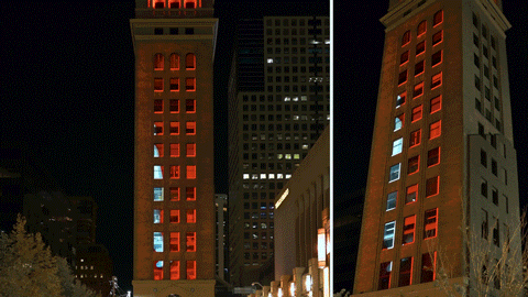
From Beneath the Earth, Motomichi Nakamura, Denver Digerati commissions for Night Lights Denver, courtesy of Third Dune Productions
In Japan we have something called Shinto. In Shinto we believe that everything in our life has a spirit in it. So, for example, a broom has a spirit in it. A chair has it. A building has it. An apple has it. I’ve been away from Japan for a long time but people actually do believe that's where I grew up. They say treat your chair, table, or broom nicely because there’s a spirit in it. We grew up in that sort of environment and it’s very natural for me to think that way. Until I came to the US and realized people actually don’t see things this way. So, the idea that everything has a spirit in it comes naturally to me. Then to put the eyes on something is putting the idea in practice.
Since your work is often displayed in public spheres, what do you believe is the role of the artist in society?
I think art needs to trigger something. Even with the eyes, you know? There might be a stupid trash can, but if I put eyes on it, then people see it as a funny trash can. So, next time they put something in the trash, they might be a little nicer to the trash can. You know what I mean? I don’t tell them to not vandalize, but if I can just lead them in a way to think, “Hey, you know, maybe the trash can doesn’t want to be kicked around” – so, that kind of stuff. I don’t see art as something to represent beauty, to be honest. I think art is something that communicates with people.

Red Eyes @ Little Island Hudson River Park, NYC, courtesy of the artist
Motomichi Nakamura, Japanese born and graduated from Parsons School of Design in New York, is an award-winning illustrator, animator, projection mapping artist and educator, based in Croton On Hudson, NY.
His animated films have been screened at Sundance Film Festival, Onedotzero Festival, Pictoplasma, Holland International Film Festival among many and his recent experimental film “Okami” won in The Leeds International Film Festival. His projection installation work has been exhibited globally in numerous museums and galleries including the New Museum of Contemporary Art in New York, Winzavod - Moscow Contemporary Art Center, MARCO in Monterrey Mexico, Gaite Lyrique Paris among others.
Commercially he has worked on projects for clients such as Channel 4, EA, MTV, USA Networks, UNIQLO and produced illustrations, campaign designs, short films and music videos for artists including Nicola Cruz and the Swedish band The Knife.
Instagram: @motomoichi_nakamura
Halleta Alemu is a multimedia writer whose work is an act of dissection – of zooming into the particles of reality to create new forms. Subscribe to her substack Electric Blue to read her poetic observations of the world.